Complete documentation for setting up, managing, and using HelpButtons networks.
MAY 2026
Coordinator Guide
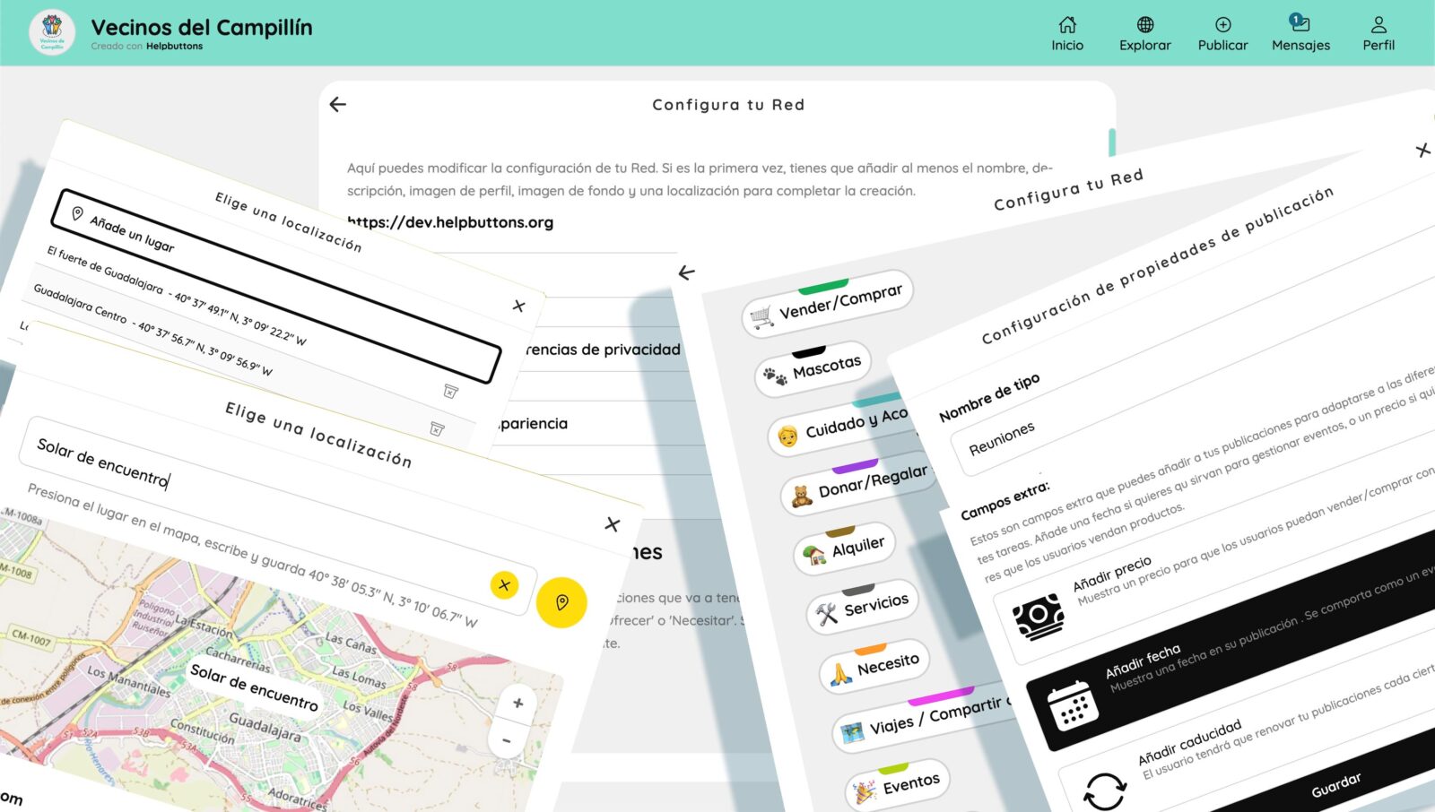
1. Creating a Network for the First Time
When you access your HelpButtons instance for the first time, the setup wizard will guide you step by step through creating your network. Below are the fields and decisions you will need to make.
Basic Information
Network name — the name all users will see (e.g. “Neighborhood Help Network”).
Slogan — a short phrase that appears on the homepage. It helps tell in a few words what your network is about.
Description — a long text explaining the purpose of the network. Displayed mainly in the FAQ section and as an excerpt of 300 characters on the home page.
Language — the default interface language. Users will be able to choose a different language when they log in.
Visual Identity
Logo — a square image of 400×400 px representing the network.
Cover image (jumbo) — a welcome banner that appears at the back of the Home Page. Recommended size 1500×1500 px.
Background color and text color — define the visual palette of the network. You can preview them in real time from Settings.
Custom Nomenclature
You can rename the concept of “helpbutton” to something more suited to your community (e.g. “initiative”, “announcement”, “resource”). It is defined in singular and plural, and that word will appear throughout the interface.
Button Types (Templates)
Define what categories of publication will exist in your network. Each type has:
Its own name, icon, and color.
Optional custom fields: price, event date, free field, etc.
The most common types are: offer, need, business, exchange, resources, event, sale. You can add as many as needed or remove unused ones.
Map Configuration
Map center — geographic coordinates where the map will open by default.
Initial zoom level — how close or far the map appears when entering.
Type of tiles — open source images that represent the world: satellite, political, watercolor. These are external open source references (OSM, Esri, etc.) outside our control. Select your favourite.
Privacy and Access
Invitation-only network — users can only register with an invitation link/code generated by coordinators.
Button approval — new helpbuttons must be approved by a coordinator before being published.
Allow anonymous participation (guest) — allows users without a full account to create helpbuttons, make comments, and send messages. If disabled, only users with an email can participate.
Currency
If you use button types with price (sales, services), define the currency to display (€, $, etc.).
Recommended Tags
You can pre-configure tags (hashtags) that will be suggested to users when creating helpbuttons or when registering. Users can subscribe to these tags and receive notifications about activity on those topics.
Location Options
Hide country in addresses — only shows city and street, without country.
Hide location by default — new helpbuttons will hide their exact address (showing a wider area) unless the user enables it.
Policies and Contact
Privacy policy — legal text or link explaining what you will do with user data. We strongly recommend elaborating this carefully.
Ethics policy — community usage rules. Think about the values that govern objectives and interactions in your app, what users must respect, and what happens if they don’t.
Contact email — public address for users to contact coordinators. Defaults to HelpButtons contact.
Key Spots
You can mark important locations on the map (a town, a neighborhood, a community center, a square) that will appear as quick links on the network homepage. This is especially important if your network covers several population centers. Users can easily jump to those locations and check what is being published there.
2. HomeInfo — The Network Homepage
HomeInfo is the home page that all users see. It displays:
Logo, network name, and slogan.
Quick action buttons: Explore the map, Create a button, Invite someone.
Statistics: total number of helpbuttons by type and number of registered users.
Key spots: quick links to the locations you configured.
Extended description: the first 200 characters with a “Read more” option.
Recent activity: the latest published helpbuttons and posts with timestamps.
Top hashtags: the 10 most used tags in the network.
Pinned tags: the recommended tags you configured as coordinator.
Managed by: list of coordinators with contact information.
Install the app: option to install as a PWA (app on mobile) and enable browser notifications.
Location detection: if the user grants permission, shows a direct link to the map centered on their area.
Frequently asked questions (FAQ): link to the help section.
HomeInfo is your network’s first impression. A good description, a clear logo, and useful pinned tags are essential for orienting new users.
3. Explore — The Map
The Explore section shows all published helpbuttons on an interactive map and in a list. When zoomed out, helpbuttons that are close to each other collapse into clusters.
What a user (and you as coordinator) can do in Explore:
Navigate the map: zoom and scroll to view helpbuttons in different areas.
List view: toggle between map and list of helpbuttons sorted by date, proximity, or price.
Advanced filters: search by text or tag; filter by button type; filter by location and radius (distance in km); filter by custom fields (price range, event dates); filter by recency.
View button detail: clicking a cluster or list item opens the full button card.
Follow a tag: from the filter panel, after searching a tag, click “Follow tag” to add it to your profile and receive notifications about that topic.
4. User Profile
The profile page displays:
Avatar, name, and username (the identifier used inside the network).
Description / bio.
HelpButtons created by that user (if not hidden).
Visible contact information (email, phone if public).
Coordinator shortcuts (only if you have coordinator role): direct links to Settings and Moderation.
5. Edit Profile
From “Edit profile” the user (and the coordinator) can modify:
Personal Data
Name, email, phone.
Profile photo (avatar).
Description / bio.
Preferred language — the app will always show in that language when you log in.
Show or hide their helpbuttons on the public profile.
Show WhatsApp link.
If you add a phone number, it will show automatically on your helpbuttons.
Publish phone number on the home page (coordinators only).
Notifications
Enable or disable notifications.
Reference address: from where to calculate distance for alerts.
Notification radius: maximum distance (0 = infinite, up to 300 km) to receive alerts for new helpbuttons on topics you follow.
Followed tags: hashtags whose new helpbuttons will generate a notification.
Security
Change password (requires confirmation).
Delete account (non-coordinator users only).
Coordinator options are available under the profile page for coordinators only.
6. Network Settings
The Settings section allows coordinators to modify at any time everything configured when creating the network: name, description, slogan, logo, colors, button types, templates, policies, key spots, etc.
Button Types: after first creation, if a type has custom fields (like date, price, etc.) and users have created helpbuttons of that type, you will not be able to change that type’s custom fields again. If needed, create a new button type and hide or delete the old one.
Color changes are visible in real time on the site.
Accessible from the main menu (visible to coordinators only).
For complete detail of all configuration options, refer to section 1 of this guide.
7. Moderation
The Moderation panel is exclusive to coordinators. It is divided into several sections:
Users
Displays the list of all registered users with pagination and search by email or name.
Available actions on each user:
Action
Description
Promote
Converts a registered user into a coordinator
Revoke
Removes the coordinator role (returns to normal user)
Block
Prevents the user from accessing the network
Activate
Unblocks a user that was blocked
Verify
Marks the user as verified — a trust badge visible on their profile
What does verifying a user mean?
Verification is a trust mark visible on the user’s profile. It indicates that a coordinator has confirmed the identity or legitimacy of that person within the community. It is managed from the moderation panel.
What does blocking a user mean?
Blocking prevents that user from accessing the network. Their account still exists in the database but they cannot log in or interact. You can reverse it with “Activate”.
HelpButtons Pending Approval
If the network has the “HelpButton approval” option enabled, new helpbuttons enter a review queue rather than being published directly. From here you can:
View the list of pending helpbuttons with date, title, type, tags, and location.
Approve a helpbutton so it is published on the map.
Edit the helpbutton before approving it.
Preview how it will look.
Published HelpButtons
List of all helpbuttons already published in the network. You can search them, view their details, and edit them directly.
Download CSV (Upcoming)
Downloads a CSV table to the coordinator’s device with all published helpbuttons organized by rows and columns — useful for internal management.
Broadcast Message
From Moderation you can send a message to all verified users of the network. Useful for announcements, maintenance notices, or community news.
8. Communication: Public Comments and Private Messages
Public Comment System
Public feed / thread under a helpbutton: groups all public comments and posts. Owners can publish update posts to add new info for public discussion and notify subscribers.
Public comments: any user can write a comment on a button’s feed. Everyone can read them, even when not logged in. The button owner can moderate this section.
Private Messaging System
Message page: visible in the navigation menu when logged in. The Activity Feed groups all messages and notifications about helpbuttons the user is active in, sorted by date.
Private messages: visible only between sender and receiver. Any user can start a private message chat with a helpbutton owner — the same two users can have several private chats, one per helpbutton they cooperate on.
Group messages: every network has two group message forums — one for all community users, one for coordinators only. Use the community forum for support in early stages or community-wide discussions; use the coordinator forum for network moderation.
As a coordinator you can:
Delete any inappropriate comment.
Moderate button content.
Moderate messages in group chats.
Send broadcast messages to the entire network from the Moderation panel.
Alerts and Notifications
The notification system has three layers:
Browser notifications (desktop/mobile): activated with explicit user permission. They appear as operating system notifications.
Email notifications: sent when there is activity on helpbuttons the user follows or has created, and when new helpbuttons appear with tags they follow, within their configured radius.
In-app alerts: informational or error messages that appear on screen while using the platform.
9. Login Systems
HelpButtons offers several authentication methods:
Method
Description
Email + Magic Link
The user enters their email and receives a one-time link. Clicking it authenticates them — no password needed.
Email + Password
Traditional registration and login.
Standard Registration
Username, email, password, terms acceptance, and language selection.
Invitation Registration
If the network is invitation-only, the user needs a code or invitation link to register.
Guest Access (QR / Code)
Allows creating an anonymous account from a QR or guest code generated by a coordinator or user. HelpButtons will be moderated before publishing.
10. Bulletins (PDF)
The Bulletin function allows generating a downloadable PDF with a selection of helpbuttons from the network. When generating a bulletin you can configure:
Time period: last N days.
Filters: the same as in Explore (location, tags, button types, custom fields).
Each helpbutton in the PDF includes:
Title, type, tags.
QR code that links directly to the button card.
Images, description, custom field values.
Creator contact information and location.
Useful for printing and distributing physically on bulletin boards, events, or community meetings.
11. QR Cards and Invitations
As a coordinator, from the invitations section (in your profile > moderation) you can generate invitation QR codes for new users to join the network. When creating an invitation you configure:
Expiry time: never, 1 hour, 1 day, 1 week.
You can share the invitation as a link or as a QR image to print. From Moderation you can see which invitations have been used.
User Guide
1. Creating an Account
To register you will need:
A username.
Your email address.
A password.
Acceptance of the terms of use.
If the network is invitation-only, you will need an invitation link or code shared by someone in the community. Ask a coordinator for a QR invitation if the network is private or you do not use email.
2. Creating a HelpButton
A “helpbutton” is a publication on the map: it can be an offer of help, a need, an event, a sale, a business, etc. (the available types depend on how the coordinator has configured the network).
Steps to create a helpbutton:
Press the “Publish” button (available from the main menu or from the homepage).
Choose the button type (offer, need, event, etc.).
Write a clear and descriptive title.
Add a detailed description (optional but recommended).
Upload up to 5 images if desired.
Add tags (hashtags) that describe the content. Tags make it easier to search and categorize content.
Indicate the location: search for an address or move the marker on the map. You can hide the exact address for privacy. If the location is not found, an “Add a custom location” option will appear — use it to save a custom name as your place.
Fill in any additional fields if present (price, event date, etc.).
Press Publish.
If the network requires approval, your helpbutton will be on hold until a coordinator reviews it.
The form automatically saves a draft on your device, so if you close accidentally you will not lose what you have written.
3. Following Tags and HelpButtons
Following Tags
Tags (hashtags) are the way to classify content. When you follow a tag:
You will receive notifications when a new helpbutton is published with that tag.
Only if that helpbutton is within the distance radius you have configured in your profile.
You can follow tags from:
Your profile (notifications section in “Edit profile”).
The filter panel in Explore (“Follow tag” button).
Following HelpButtons
You can subscribe to a helpbutton by pressing the bell icon on its card. This subscribes you to its activity: you will receive notifications when someone posts a new comment on that helpbutton. Press the bell again to unfollow.
4. Commenting on a HelpButton
Each helpbutton has a public comment board. You can:
Write a public comment (visible to everyone).
Attach up to 5 images in each comment.
Mention other users with @name.
Reply to a specific comment (nested thread).
Delete your own comments.
Comments show the author’s avatar, name, and time. Mentions appear highlighted.
5. Messages and Group Messages
The Messages section (or “Activity Feed”) groups all notifications for helpbuttons you interact with, in a chat-like view.
You can filter activity by button type.
You will see conversations sorted by date.
You can reply directly from that view without having to open each helpbutton separately.
It is the fastest way to stay up to date with everything happening in the helpbuttons you are interested in.
At the top of the Messages section you will find a community group for idea exchange, reports to coordinators, and common daily issues.
6. Editing Your Profile
Go to the user menu and select “Edit profile”. From there you can:
Personal Data
Change your name, email, or phone.
Upload or change your profile photo.
Write or edit your description/bio.
Change the interface language.
Choose whether to show or hide your helpbuttons on your public profile.
Enable or disable the WhatsApp link on your profile.
Notifications
Enable or disable notifications.
Set your reference address: from where you want to receive alerts.
Adjust the radius: the maximum distance (in km) at which you want to receive notifications for new helpbuttons.
Manage the tags you follow (up to 10).
Security
Change your password.
Delete your account (if you decide to leave the network).
7. Login
With Password
Enter your email and password in the login form.
With Magic Link (recommended)
Enter your email and you will receive an email with a one-time access link. Clicking it authenticates you. It is more secure because you do not need to remember a password and the link expires after use.
If you forgot your password, use the magic link to log in and then change it from “Edit profile”.
With Guest Code
If the network allows anonymous login, select “Login as Guest”, generate a Guest Code, save it if you want to return in the future, and add your name. You will be able to interact, but your helpbuttons will be moderated before final publishing. Ask for verification in the community chat of the Messages section to unlock all features.
— End of English Guide —
We use cookies to improve your experience on our site. By continuing to browse, you accept our use of cookies.